


My favorite 7 charts of January
And why things are better than you might think.

One of my favorite books is Factfulness by Hans Rosling. I first read this book in March of 2021 after a hard year for what seemed like months of bad news and dire outlooks. I credit this book for protecting me from chronic cynicism and pessimism about our world.
Although our world is far from perfect, statistically the human race has never had it better. I remind myself that my ancestors would likely trade places with me in a heart beat if they had the chance.
Always be careful of comparative adjectives like, better, worse, higher, lower, etc. They often tell partial stories and require more context and perspective to fully understand.
I’d like to share 6 recent charts that might help bring some ‘clear skies’ to our outlook.
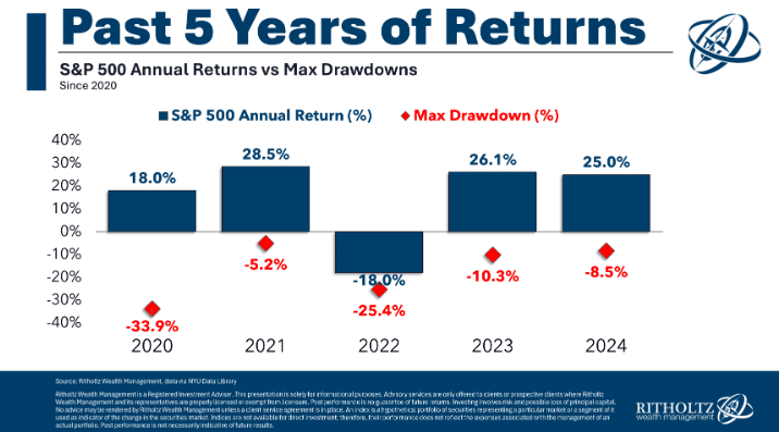
Volatility and Returns
Proper ‘scorekeeping’ is critical in investing. The calendar months and years carve up investing performance into somewhat arbitrary periods which don't tell the whole story.
The S&P 500 finished 2024 up around 25% and that period and percentage gets most of the attention.
However, does anyone remember anything about the -8.5% drawdown? Nope. It was a blip dip in August followed by a steep 8% gain in under 30 days. Volatility is normal and good, just accept it.
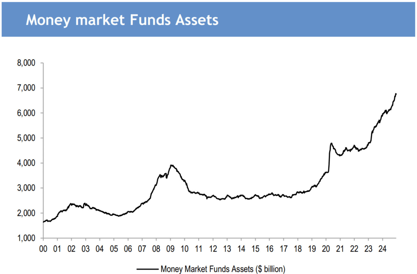
Money Markets
In just 5 years, money market accounts have doubled to record highs. As a reminder, money market accounts are very similar to a savings account but they pay more interest.
For example, I like VMFXX for my clients which yields 4.28%. Earning over 4% almost risk-free is pretty great. Although inflation cuts into this a bit. More on that later.
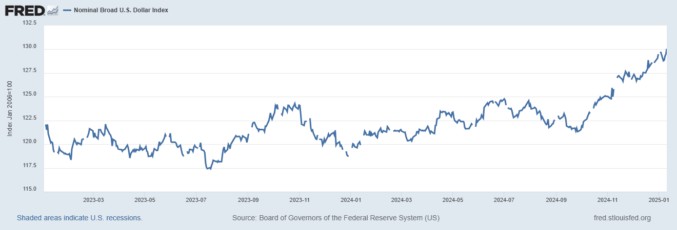
Dollar Power
Occasionally we hear things in the news about the weakening US dollar. There are dozens of variable factors that affect the value of a currency. Just know that the US dollar is still the unofficial world currency and this chart shows its growing strength relative to other nation currencies.
The need to find a ‘safer’ place to store wealth outside of the dollar is likely unnecessary.
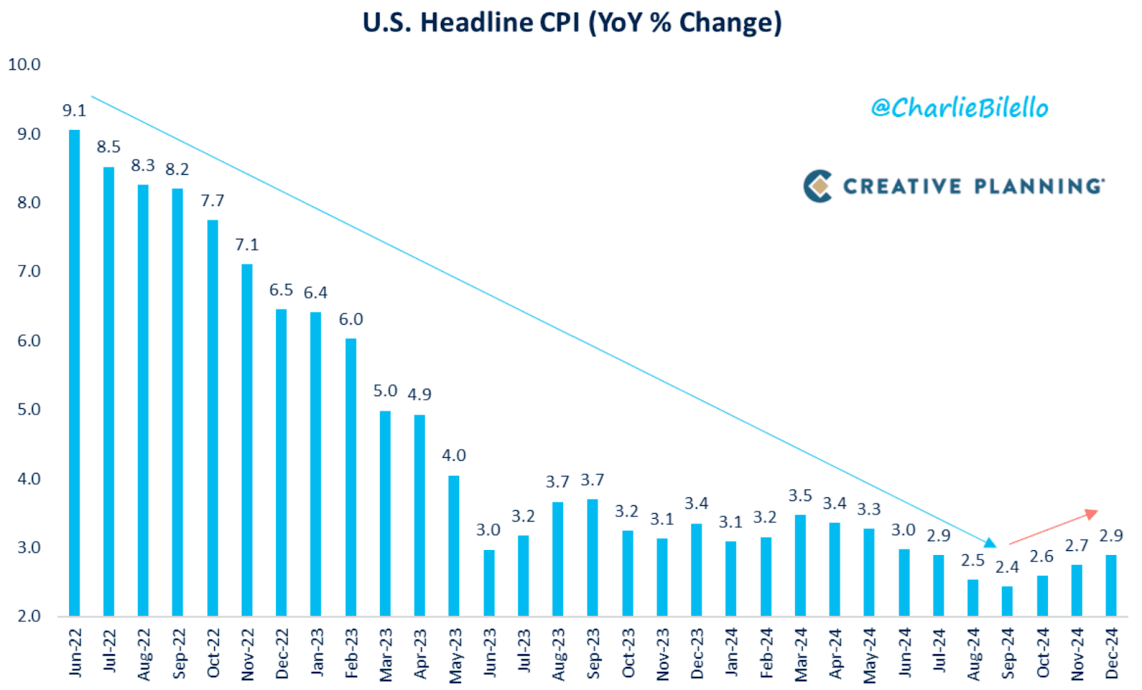
Inflation
Inflation might be the most impactful and most misunderstood of the topics in this post. It, like many other economic indicators, are frequently weaponized by both sides of the aisle as a leverage point to influence policy.
The Fed has by all accounts played its cards as well as can be expected given the downward trend in inflation followed by a leveling off over the past 12 months. With inflation this low, its unlikely interest rates will be lowered.
Which debt will continue to be more expensive than we are used to. Conversely, money market accounts will pay out a good amount of money at near zero risk levels.
All in all, inflation is in a good, manageable place.
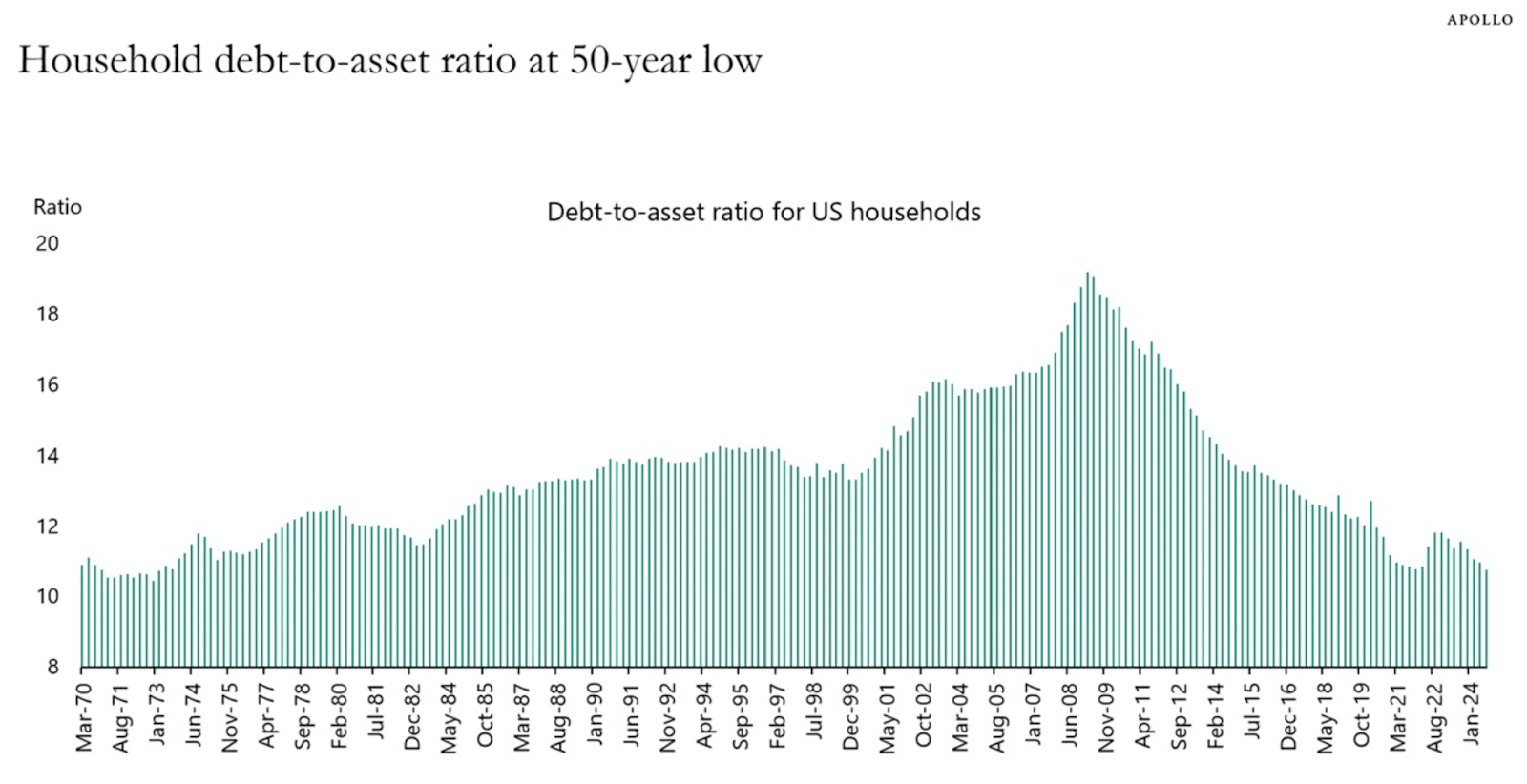
Consumer Debt
This one shocked me. Americans’ balance sheets have never been stronger. A balance sheet is a report that compares one’s assets (things you own) and liabilities (things you owe).
Here is an example: Pete’s assets total $500,000 (home equity, investments, bank accounts, etc) and his liabilities or debts total 65,000. His debt-to-assets ratio is 13%.
As I mentioned above, this only tells part of the story however as a whole our nation’s financial situation is trending in the right direction.
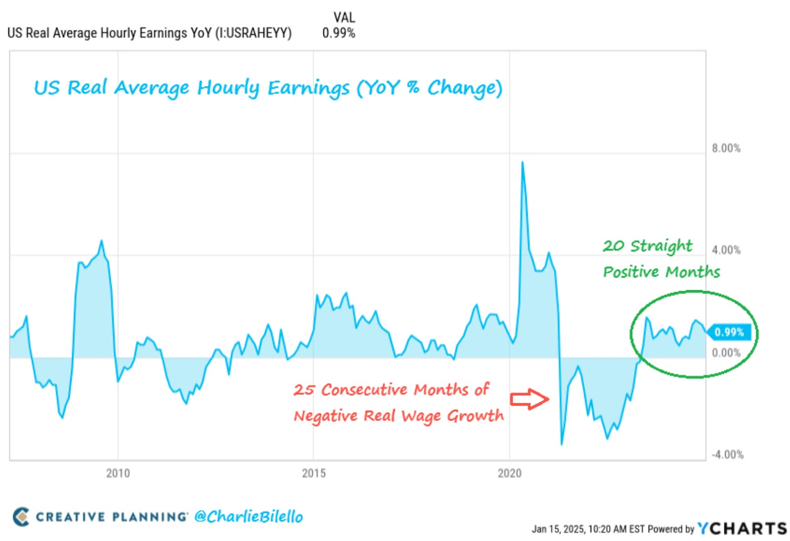
Wages
The big concern with inflation for most people is that if their income stays flat and their expenses rise. Hourly wages have increased for 20 straight months.
With rising wages, we can only hope that families can support themselves amidst the higher inflation and propel the economy forward for another 12 months.
In Summary
Uncertainty is certain. Despite all these positive economic charts, there are some legitimate concerns coming.
But let's be honest; isn't there always something to to worry about?!
Maybe with a few of these charts, your worries will act like my hairline and recede.
Cody Murray, CFPⓇ